
Role
Duration
Industry
Scope
Figma
Miro
Sticky notes
Sketching paper
Markers, pens
Situation Overview
The millennial generation is grappling with the Herculean task of balancing their current financial needs with saving for the future. This undertaking is further complicated by a culture of instant gratification and an inclination towards spending on immediate wants rather than long-term savings goals.
Statista's research, conducted in 2021, found that millennials aged 27 to 40 are the most active online shoppers, comprising a third of all Canadian online shoppers.
This is hardly surprising given that the 2020 Consumer Culture Report from public relations agency 5WPR revealed that 64% of millennial shoppers (age 18-34) are more inclined to impulse purchases. The poor spending habits of millennials have made managing personal finance a frustrating and exasperating experience for the group.
This underscores the pressing need for support for this demographic to assist them in effectively managing their finances and achieving their long-term savings goals.
The Problem
The modern digital landscape, with its abundance of services linked to bank accounts and lease of making quick purchases, has made it increasingly challenging for individuals to manage their finances and achieve long-term financial goals.
The pervasive tendency to overspend poses a significant challenge, hindering progress towards financial planning.
How might we help individuals reduce excessive spending by staying focused on their financial goals?
Project Objective
We aim to create a personalised finance management solution that seamlessly and efficiently tracks expenses and manages budgets.
By doing so, users are empowered to effectively work towards their financial goals, fostering greater control and success in their financial journeys.
Target Audience
The target user demographic for our solution primarily comprises working professionals in their late 20s to early 40s.
These individuals have stable income but face challenges in managing their finances effectively. They seek a streamlined, user-friendly approach to develop healthier spending habits and attain financial goals.

Empathise
Research Goals
Understand the users
Confirm we are solving the right problem
Identify the gap in the market
Secondary research
The project's initial phase involved conducting desk research to understand the subject comprehensively.
As part of this research, I read the book "Broke Millennial" by Erin Lowry, which shed light on how many millennials experience significant stress and anxiety when managing their finances.
The report by Meridian Credit Union further supports this finding, revealing that 55% of Canadian millennials find dealing with money to be a source of stress and fear.
These insights highlight the pressing need for solutions that can assist millennials in achieving their financial goals.
However, to ensure the validity and effectiveness of the project, it is crucial to validate the idea with the intended users.
Idea Validation
To evaluate the idea, a survey was distributed to 29 participants. 24 were intended users who provided valuable insights.
We also included 5 participants who said they would never use the app.
We wanted to gain unique perspectives and understand why they would not engage.


Insights
The initial hypothesis was substantiated, confirming individuals encounter difficulties in managing their finances.
A noteworthy gap was revealed between personal finance management apps and users' mobile banking apps.
Users often rely on multiple tools alongside their banking app to maintain good financial health and manage their finances.
This finding emphasises the benefits of integrating personal finance management features into mobile banking apps, offering users a comprehensive and streamlined solution.
Furthermore, the survey shed light on the significance of implementing a reward system to motivate the millennial demographic.
Several respondents emphasised that a reward system would keep them engaged and serve as a driving force to help them achieve their financial goals.
This valuable insight prompted further research into understanding the specific motivational factors for millennials and exploring how the product could effectively incorporate a reward system to cater to the needs and aspirations of its target audience.
By addressing the identified gap between personal finance management and mobile banking apps, as well as integrating a reward system to enhance user motivation, the project has the potential to provide a holistic and engaging financial solution that meets the unique needs of millennials and fosters their financial well-being.
Several popular options have emerged within the expansive landscape of personal finance management apps, including Mint, YNAB, Koho, Pocket Guard, Spendee, Spending, Goodbudget, and Expensify.
Each of these apps distinguishes itself by offering a unique array of features and budgeting methodologies, catering to the diverse needs of their respective user bases.
For example, Mint simplifies expense tracking, providing users with insights into their spending habits and enabling them to budget accordingly.
On the other hand, YNAB employs a more detailed methodology emphasising future budgeting and adjusting expenses based on income. While these existing apps have garnered user feedback and achieved widespread adoption, there are still challenges that users have encountered, including concerns related to pricing and ease of use, among others.
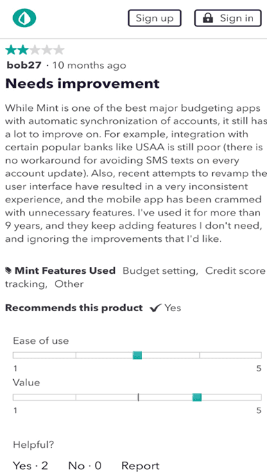
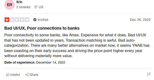
This presents an opportunity in the market to develop a free product that addresses these challenges, offering users a solution that is easy to use and provides a comprehensive understanding of their finances. By recognising these pain points and considering user feedback, the project aims to capitalise on this market opportunity and create a personal finance management app that is accessible, intuitive, and meets users' needs seeking a user-friendly and cost-effective solution.
Following the initial desk research, our team recognised the importance of gaining deeper insights into our target users.
We conducted interviews to understand their motivations, goals, and needs. Additionally, we sought to uncover their struggles and obstacles.
After gathering all the interview information, we employed the Affinity Mapping methodology. This approach enabled us to organise and group the interviewees' thoughts and concerns, allowing us to understand the problem at hand comprehensively.
By leveraging these qualitative research methods, we aim to develop a solution that aligns with the needs and aspirations of our target users.
Key Take Away
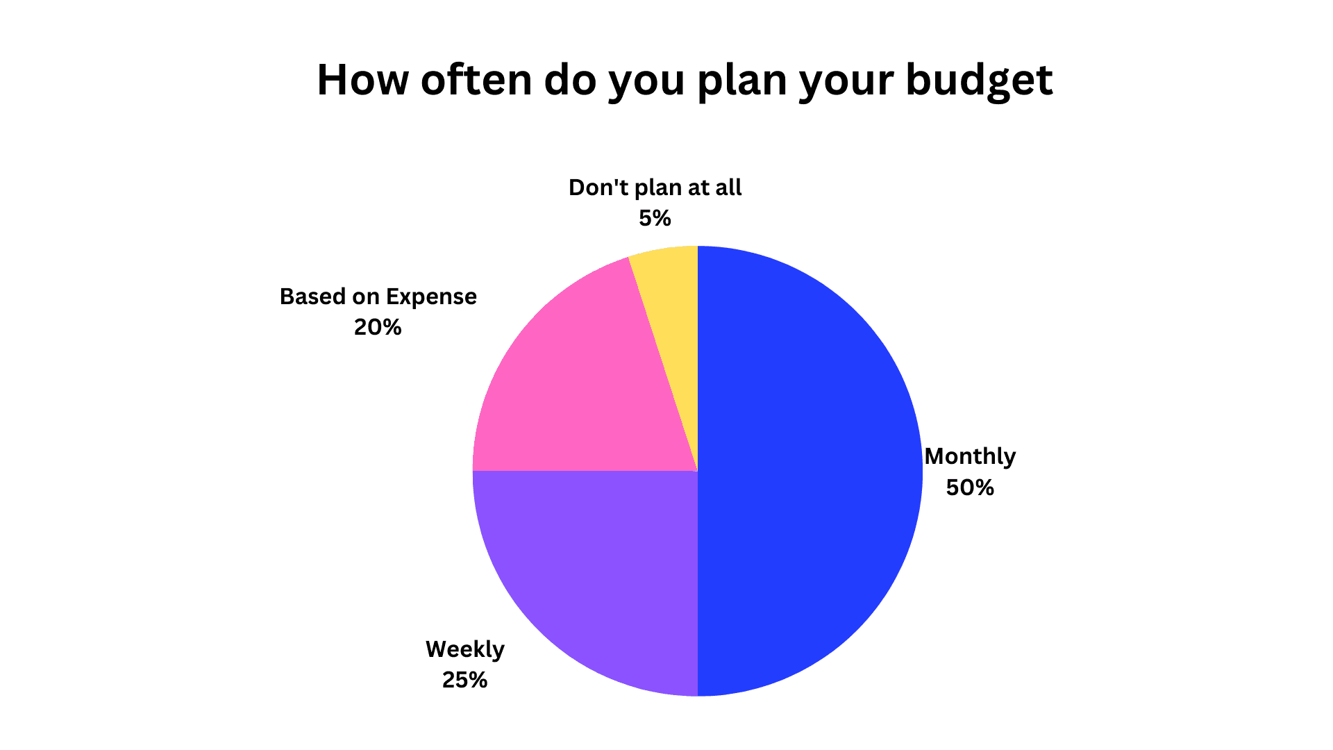
Most people need help to track every penny that they would spend.
Most people do a monthly budget for their expenses. However, a lot were unsuccessful.
Those who budget do so for financial discipline and to understand how they spend their money.


Define
Initially, the project focused on assisting millennials in achieving their retirement goal.
However, through interviews and surveys, it was discovered that people were interested in a broader range of financial goals beyond retirement. As a result, the project's concept underwent a significant shift from focusing on retirement to supporting users in achieving any financial plan.
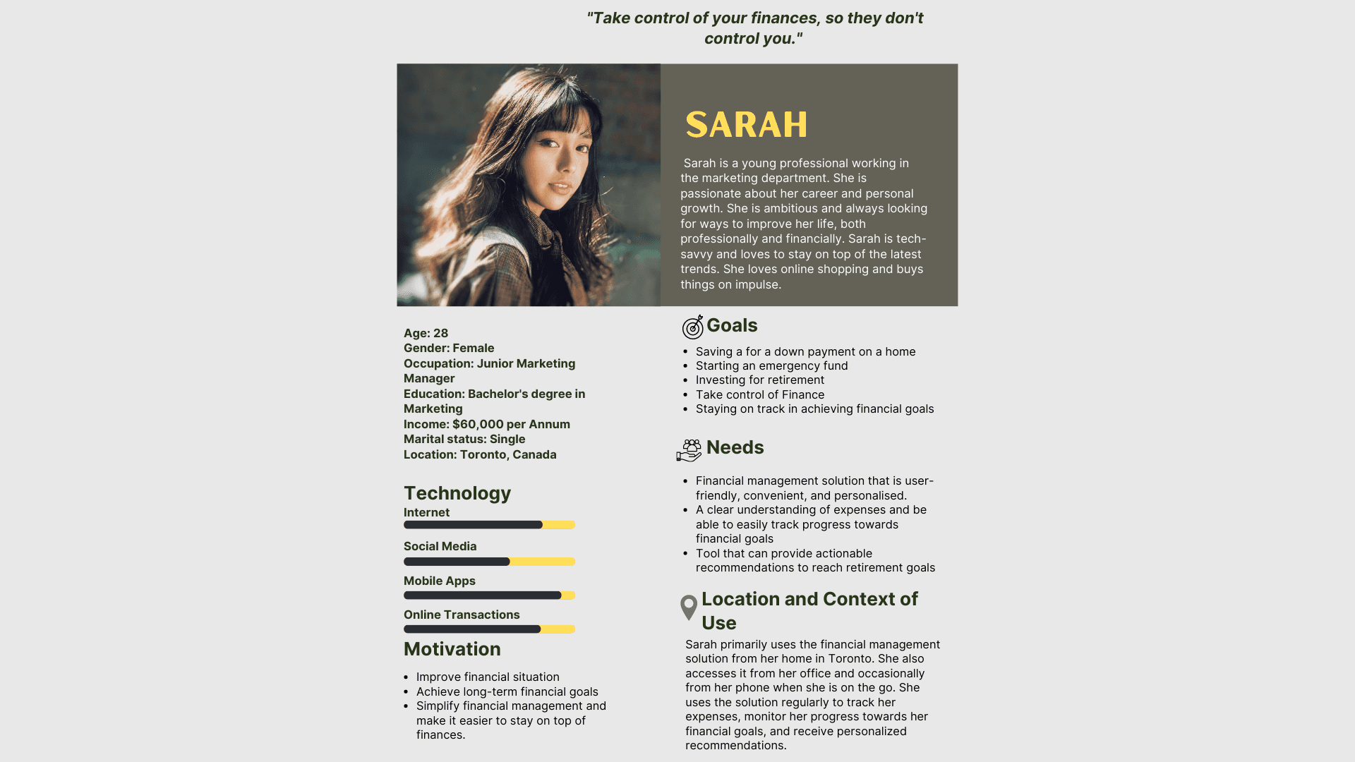
Persona
Initially, the project focused on assisting millennials in achieving their retirement goal.
However, through interviews and surveys, it was discovered that people were interested in a broader range of financial goals beyond retirement. As a result, the project's concept underwent a significant shift from focusing on retirement to supporting users in achieving any financial plan.

Key Take Away
Mobile Dominance: It is evident that most of our intended users spend a significant amount of their time on mobile devices compared to other platforms. Recognising this preference is crucial in ensuring our design is optimised for mobile experiences, offering seamless and intuitive interactions on smaller screens.
Busy User Lifestyles: Our intended users have demanding schedules, indicating they are constantly moving and likely seeking efficient solutions. Understanding their busy-bee nature allows us to design with time-saving features, streamlined processes, and easily accessible information in mind, ensuring that our product aligns with their fast-paced lifestyles.
Consolidation of Finances: With many users having multiple accounts, addressing their desire for a centralised platform to track and manage their expenses and income conveniently becomes essential. By providing a comprehensive view of their financial landscape in one place, we can simplify their financial management and enhance their overall user experience.
Moodboard
After conducting thorough research, we crafted a compelling mood board explicitly tailored for our users. This dynamic visual tool served as an invaluable guide, shaping the overall theme and atmosphere of the user experience we aimed to create. It provided a solid foundation to build an immersive and cohesive user-centred experience that resonated with our target audience.
Journey map
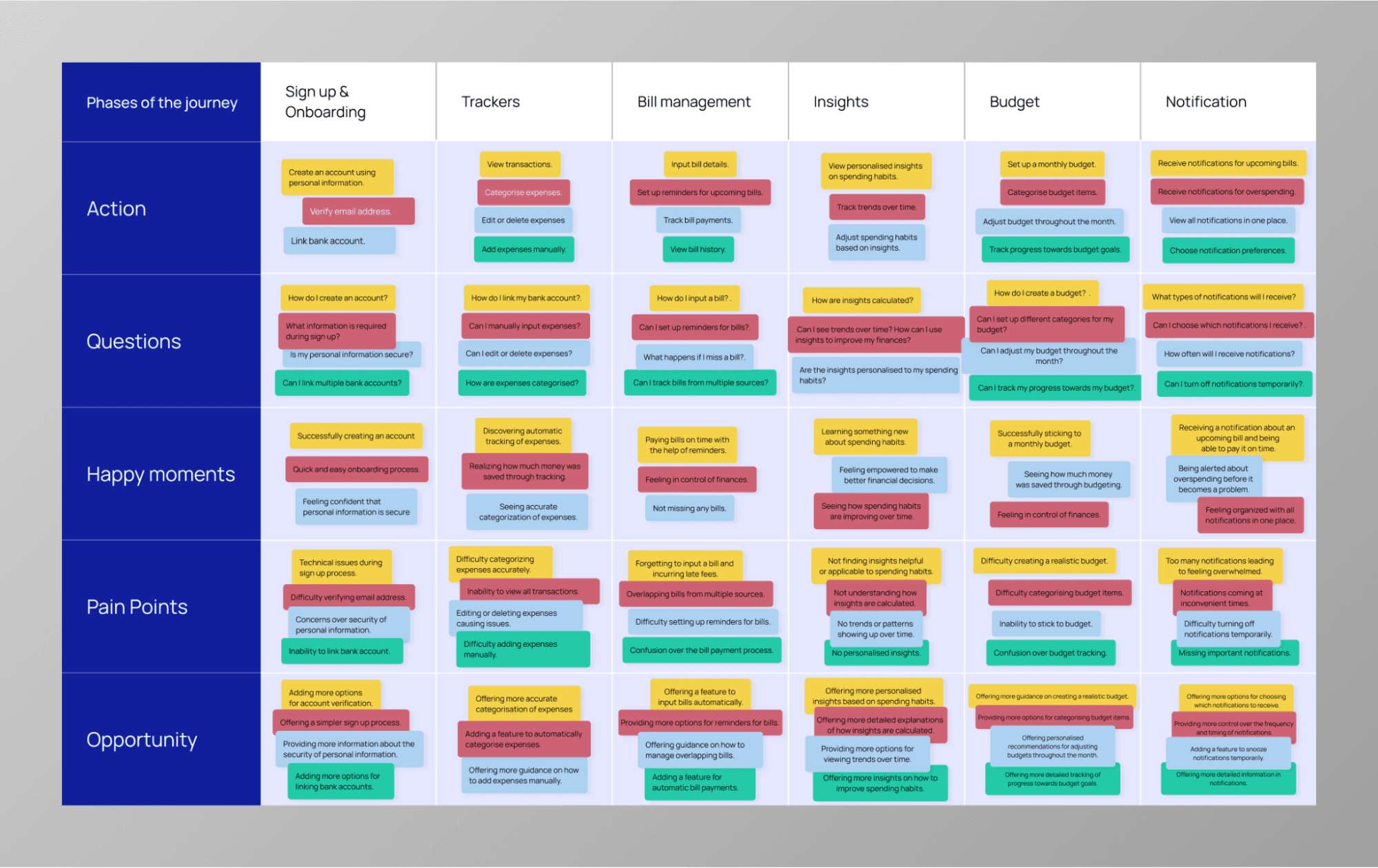
We decided to create a journey map based on the user persona and the insights gathered from the mood board. The purpose of the journey map is to visually depict the user's experience and emotions as they engage with our product or service. By mapping out their journey, we can identify pain points, opportunities for improvement, and areas where we can enhance the overall user experience.
Ideate
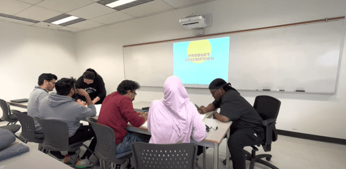
We fostered a dynamic atmosphere of creativity and collaboration during the ideation stage through extensive brainstorming sessions. Our team harnessed the power of collective thinking, engaging in lively discussions and idea generation to explore many possibilities. We encouraged open-mindedness, ensuring every voice was heard and no idea was dismissed prematurely. This inclusive approach led to a rich tapestry of diverse concepts and perspectives, sparking innovative thinking and pushing the boundaries of traditional solutions. By embracing this vibrant brainstorming process, we laid the foundation for breakthrough ideas and set the stage for a user-centric design.
Site Map
Following an engaging and productive feature brainstorming workshop, we successfully identified a comprehensive list of features that would enrich the website's functionality. We diligently crafted a well-defined site map to represent the logical arrangement and interconnectedness of these features visually. This meticulously designed blueprint is a strategic guide, illustrating the website's hierarchical structure and navigation flow. By mapping out the relationships between various pages and sections, the site map enables stakeholders and the design team to understand the website's organisation better. This clarity facilitates effective decision-making, ensuring the final design reflects a user-centric approach while accommodating our audience's diverse needs and goals.

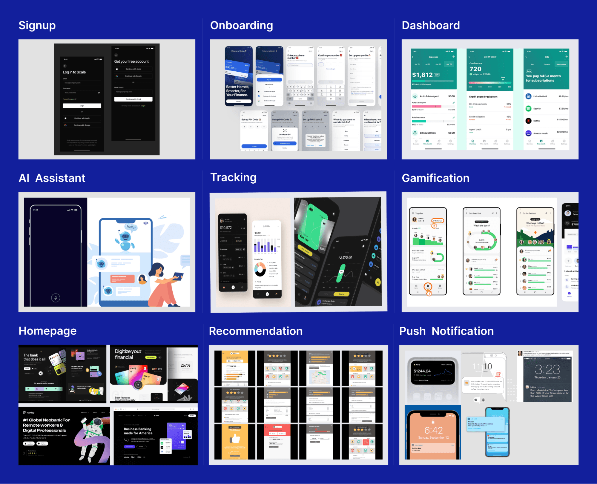
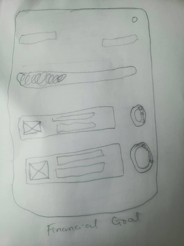
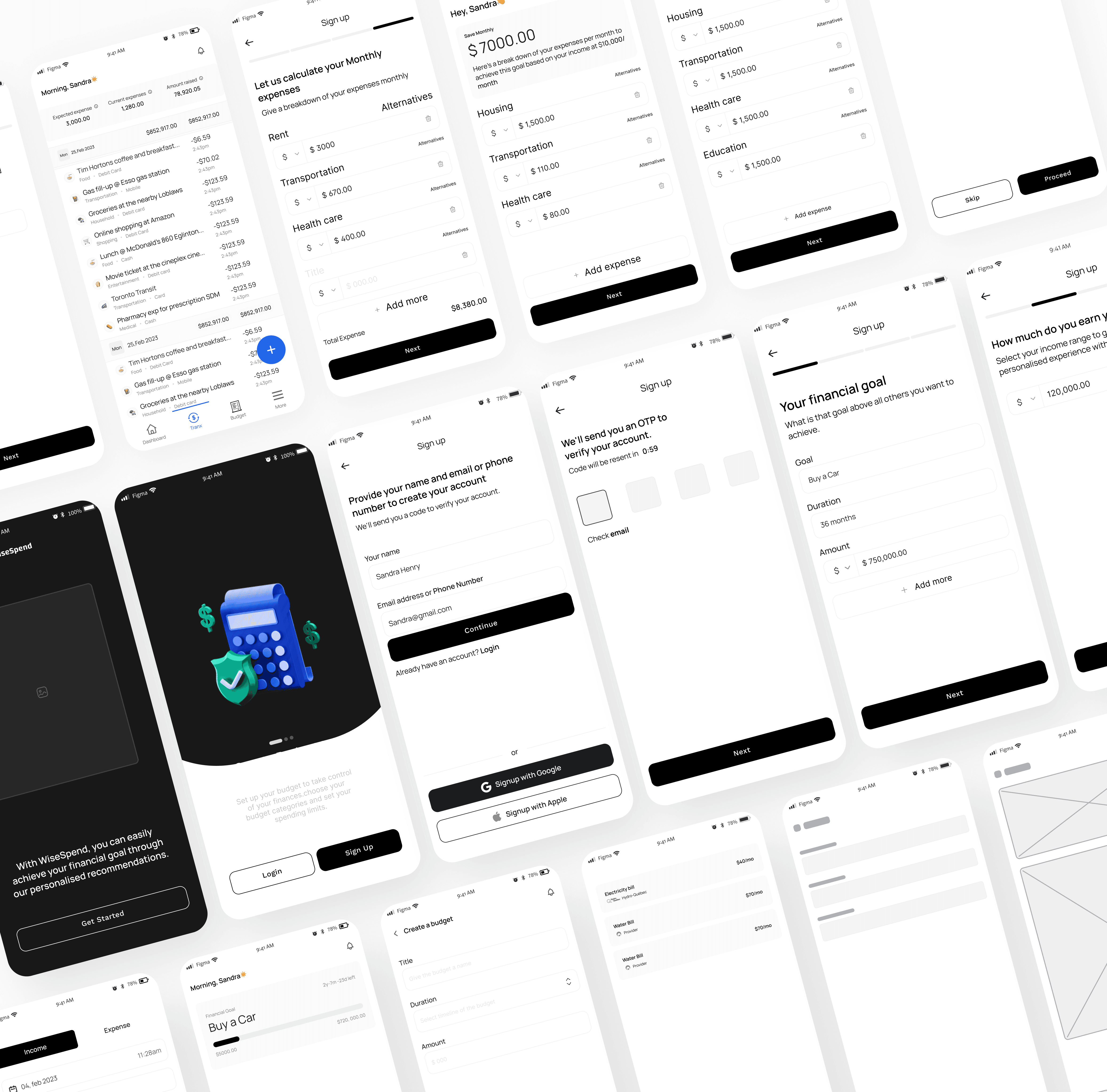
We translated our insights into tangible design concepts with the research and concept ideas becoming increasingly defined and refined. Embracing this pivotal stage, we sketched the envisioned concept, giving form and structure to our ideas. This hands-on approach allowed us to swiftly capture and visualise the essence of our concept, facilitating further discussion, feedback, and collaboration among the team. By bringing our ideas to life on paper, we paved the way for subsequent stages of the design process, where these sketches would serve as the foundation for more detailed wireframes, prototypes, and, ultimately, a delightful user experience.


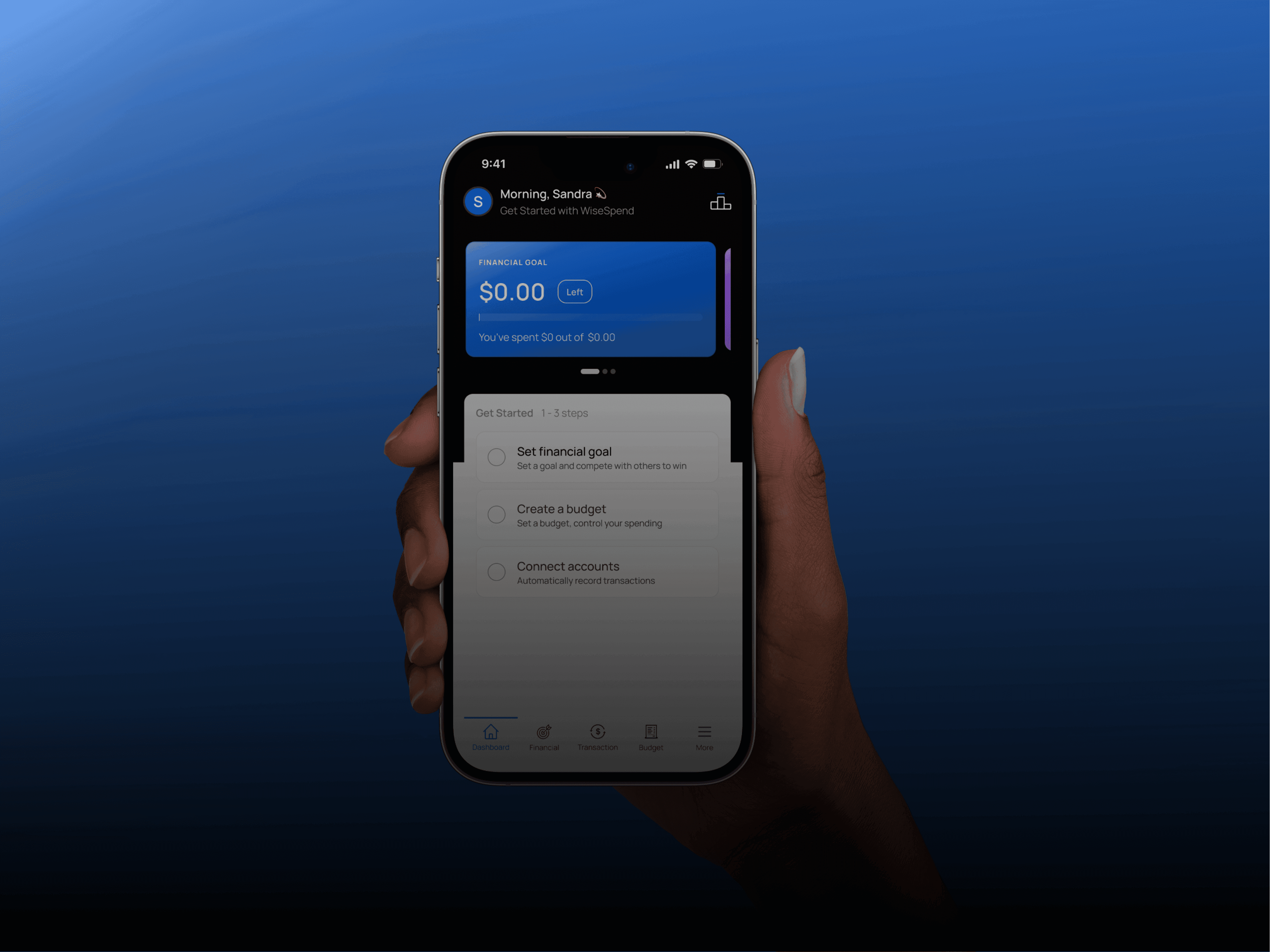
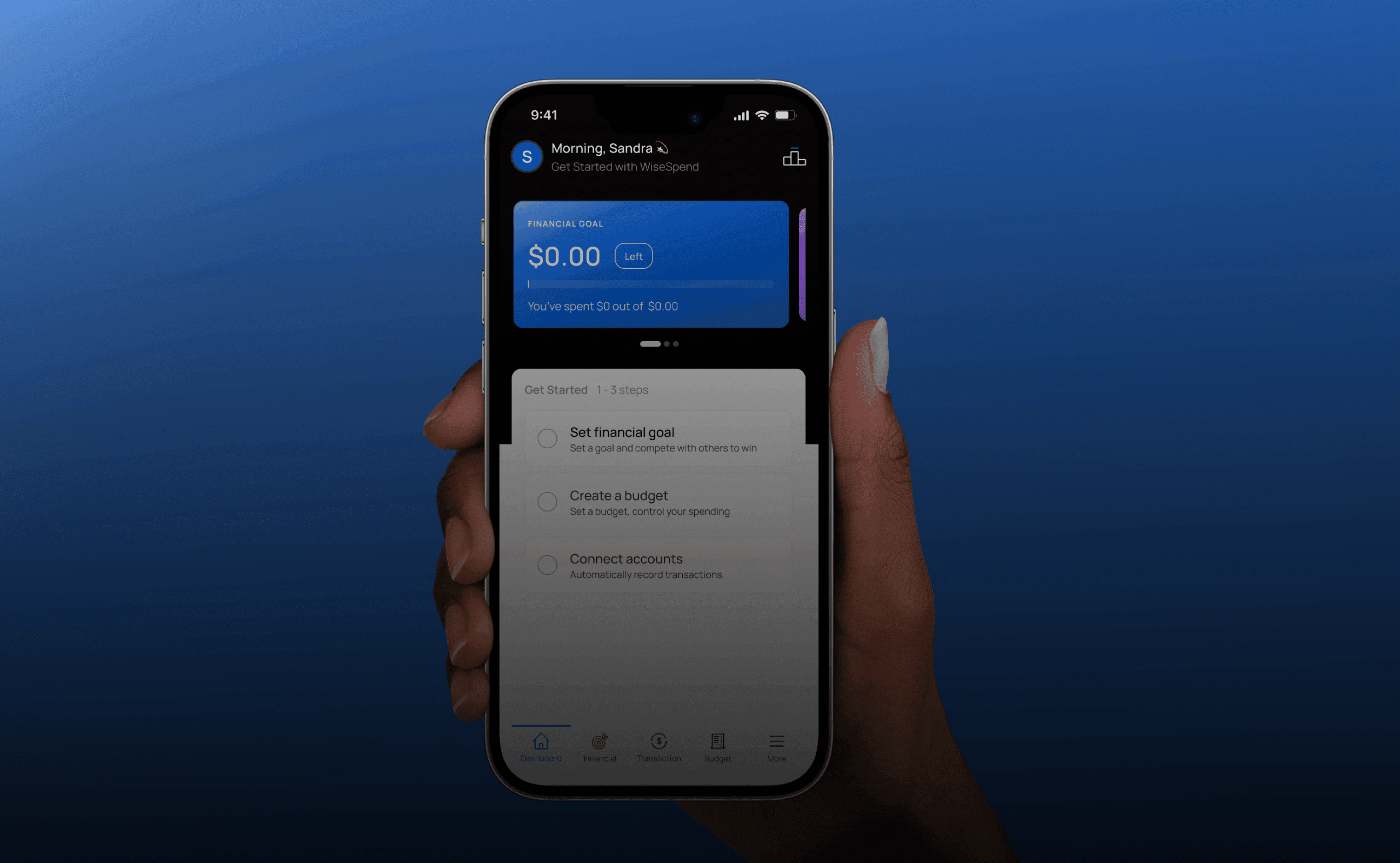
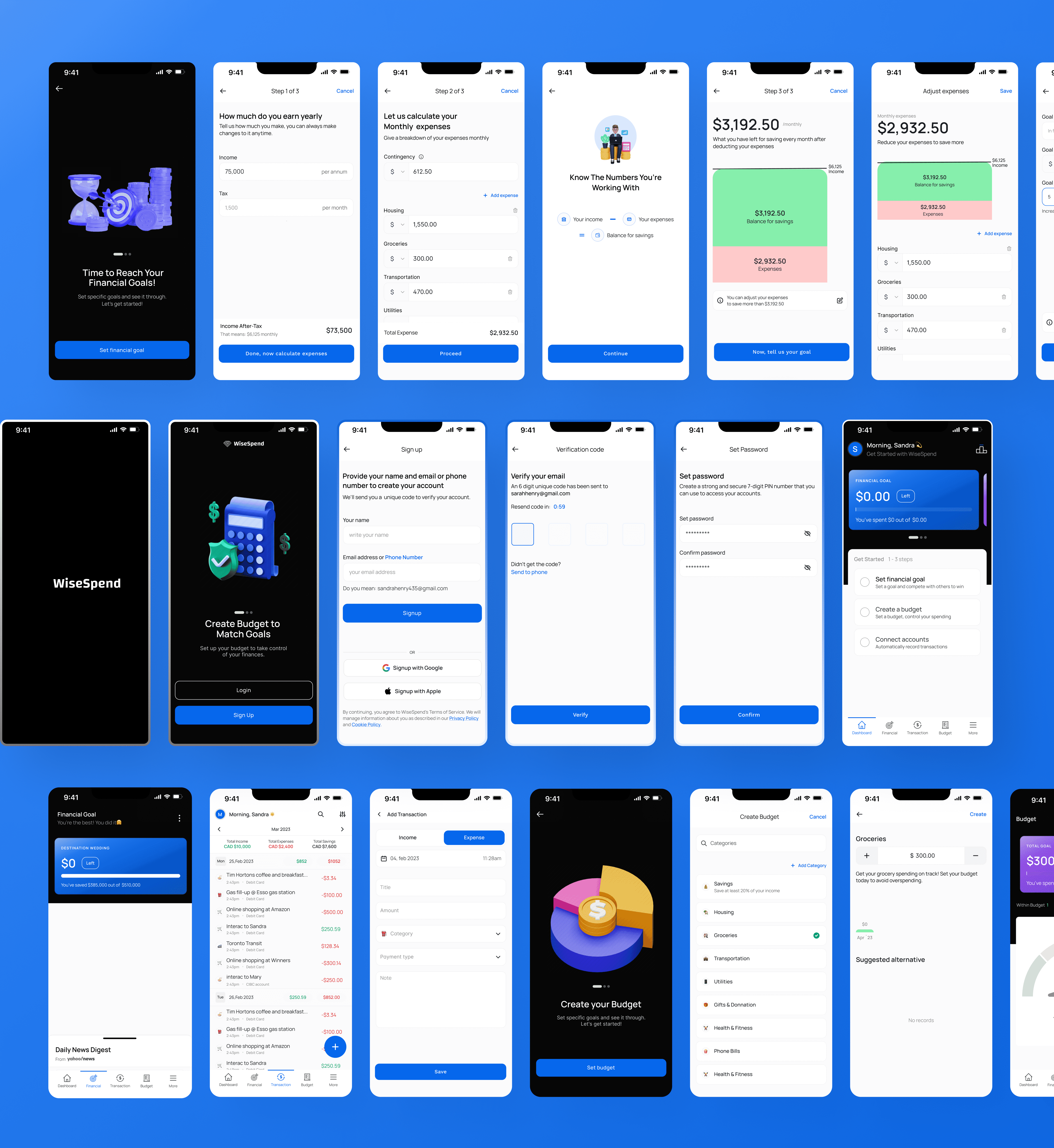
After conducting thorough research, we gained valuable insights into the concerns and preferences of our target audience.
Their strong emphasis is on data security. Armed with this knowledge, we prioritised user trust by incorporating a reassuring pop-up within the design, assuring users that their information is well protected.
Understanding the busy nature of our target audience, we strategically designed the home screen to provide a quick and comprehensive snapshot of their financial goals.
This thoughtful approach enables users to swiftly gauge the status of their goals, offering a time-saving solution for their busy lives. Additionally, we implemented a feature that allows users to access their most frequently visited pages easily, ensuring convenient and efficient navigation within the application.
Recognising the need for motivation in achieving financial goals, we introduced a leaderboard feature that encourages users to engage in collective savings with their friends and family.
This social element fosters community and healthy competition, motivating users to stay focused and committed to their goals.


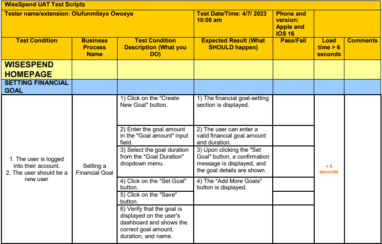
Usability Test
Objective of the Prototype Testing:
The objective of prototype testing was to closely observe users as they set up their financial goals. The testing aimed to evaluate the usability and effectiveness of the Prototype in assisting users with establishing their financial objectives.
What I asked Users to do:
Participants were instructed to use the prototype to set up their ultimate financial goal.
The process was observed to assess how easily participants could navigate the goal-setting procedure.
1. Information Collection
During the prototype testing, some participants expressed concerns about the information requested on the platform.
The participant asked, "What do you want to use this information for?"
This feedback highlights the need for transparency and trust regarding personal data. It is crucial for users to understand why their personal information is being collected and how it will be used to ensure privacy and security. This feedback made me realise that the text in the prototype did not adequately capture the user’s attention.
Modification: the use of app-guides played a crucial role in drawing users' attention to the platform's data collection practices. Through thoughtful placement and clear explanations, these guides enhanced user understanding, instilled trust, and ensured a transparent and user-centric approach to data collection.
Duration of the goal
During the prototype testing, the financial goal duration was set to years. However, feedback from some participants suggested that they preferred to achieve their goals in both years and months. For instance, three and a half years (3½). This feedback highlights the importance of providing users with flexible options catering to their needs and preferences.
Modification: To address this feedback, the prototype was adjusted to include options for both months and years for users to set the duration of their financial goals.

Reflection
Embarking on this case study project provided me with a comprehensive and invaluable experience, as it encompassed the entire UX problem-solving process from concept development to solution iterations and testing.
Each step along the way presented unique learning opportunities, which collectively established a strong foundation for me to confidently tackle future projects.
One of the key insights I gained was a profound awareness of how subtle biases can unconsciously influence design decisions.
This realization emphasized the significance of conducting thorough research and actively seeking open and honest feedback from test participants.
By remaining mindful of these potential biases, I was able to approach the design process with a more empathetic and inclusive perspective, ultimately resulting in better user experiences.
Moreover, this project allowed me to truly grasp the practical essence of design thinking. I discovered that each iteration serves as a valuable opportunity to continuously enhance the user experience.
In summary, this case study project allowed me to traverse the complete UX problem-solving journey, providing invaluable learning opportunities at every step.
It instilled in me an acute awareness of biases, emphasized the significance of research and feedback, and reinforced the essence of design thinking.
Armed with these insights, I am equipped to continuously enhance the user experience and tackle future design challenges with confidence and expertise
Thanks for reading

Post a Comment